Build a terminal app: layout & components
Over three short parts we'll build a complete, keyboard-driven to-do list in the terminal — and then a live system monitor — using klain:tui, the native terminal-UI framework. This first part is all about drawing: how a screen is described, how it's laid out, and the components you have to work with. No input yet; just pixels (well, cells). Everything compiles to a single native binary with no runtime.
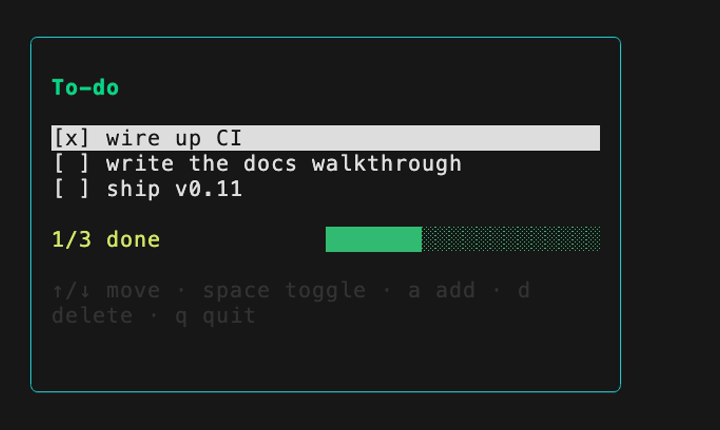
Here's where we're headed — the finished app from all three parts:
The mental model
klain:tui is an immediate-mode framework. You never mutate a widget or hold onto a handle; instead you write a function that returns a fresh description of the whole screen every time, and hand it to render(). Under the hood it sits on two pieces: Yoga — the same flexbox engine React Native uses, vendored in — for layout, and a double-buffered ANSI painter that diffs each new frame against the last and writes only the cells that actually changed. So even though you redraw everything, the terminal only sees the delta.
There's no virtual DOM, no reconciler, no component instances living between frames — the tree is built in native code and freed after each paint. That makes the whole thing a plain loop in the classic state → view → update shape:
- state — just variables: a list of tasks, which row the cursor is on.
- view(state) — a pure function returning a tree of
Box/Text/… calls. - update — read a key, change the state, call
render(view(state))again.
We'll build view here in Part 1, and wire up update in Part 2.
1 · A blank canvas
Two calls bracket any full-screen app. enter() switches the terminal to its alternate screen (so your app doesn't scroll away your shell history) and hides the cursor; leave() puts everything back. Between them, render(tree) paints. Here's the smallest thing that draws:
import { Box, Text, render, enter, leave } from 'klain:tui'

enter()                                   // alternate screen, cursor hidden
render(Box({ padding: 1, border: 'round' }, [Text('Hello, TUI')]))

if (!process.stdin.isTTY) {
  leave()                                 // piped run: one frame, then exit
} else {
  // ... an input loop goes here (Part 2); for now, just show the frame:
  process.stdin.setRawMode(true)
  // (a real app loops here)
  leave()
}
Always gate raw, interactive behaviour on process.stdin.isTTY. When the output is a pipe (say, in CI) there's no keyboard to read, so you paint one frame and exit cleanly instead of blocking forever. Every example in this series follows that pattern.
2 · Layout with flexbox
Every Box is a flex container, and its behaviour will be familiar from CSS. flexDirection is 'row' or 'column'; flexGrow lets a child soak up spare space; justifyContent: 'space-between' pushes children to opposite ends of the row. Borders, padding, gaps and colours are all just props. This is the outer frame of the to-do list:
Box(
  { flexDirection: 'column', width: 44, border: 'round',
    borderColor: 'cyan', padding: 1 },
  [
    Text('To-do', { color: 'green', bold: true }),

    // a row whose two ends are pushed apart:
    Box({ flexDirection: 'row', justifyContent: 'space-between' }, [
      Text('1/3 done', { color: 'yellow' }),
      Progress(0.33, { color: 'green', width: 20 }),
    ]),
  ],
)
Sizes flow out from the content. A Text measures itself, a Box sizes to its children (unless you pin an explicit width/height), and the root box fills the terminal. Resize the window and the very next frame re-flows — there's nothing to recompute by hand. Text is also width-aware: wide CJK and emoji glyphs correctly take two columns, so borders and columns still line up when your content isn't plain ASCII.
3 · The component kit
On top of Box and Text, Part 1's payoff is the built-in components. You compose them like any other node in the tree:
List(items, { selected })— one item per line with an optional highlight. If the list is taller than its box it scrolls to keep the selected row in view and draws a scrollbar, so you don't have to page it yourself.Progress(value)— a bar filled from a0..1value.Spinner(frame, { label })— a braille spinner; you advanceframeeach tick.TextInput(value)— a value plus a cursor block (the keystrokes are yours — that's Part 2).
The key habit: derive the components straight from state every frame with ordinary array methods. Here we turn a tasks array into list rows and a progress value:
// rows and totals are derived from state, every frame
const rows = tasks.map((t) => (t.done ? '[x] ' + t.text : '[ ] ' + t.text))
const done = tasks.filter((t) => t.done).length

List(rows, { selected: cursor })           // highlights row `cursor`
Progress(done / tasks.length, { color: 'green', width: 20 })
TextInput(draft, { color: 'cyan' })         // the in-progress new task
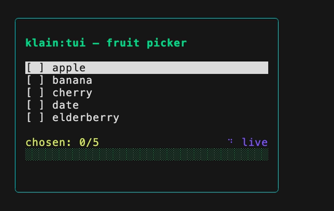
Put those together and you already have a fully drawn — if inert — screen. The fruit-picker example is the same idea end to end: a list with a live selection, a counter, a spinner and a progress bar, all recomputed each frame from one small state object.